6/27/2026 3:55:37 PM

Summer Picnic, and the Colour That Calms


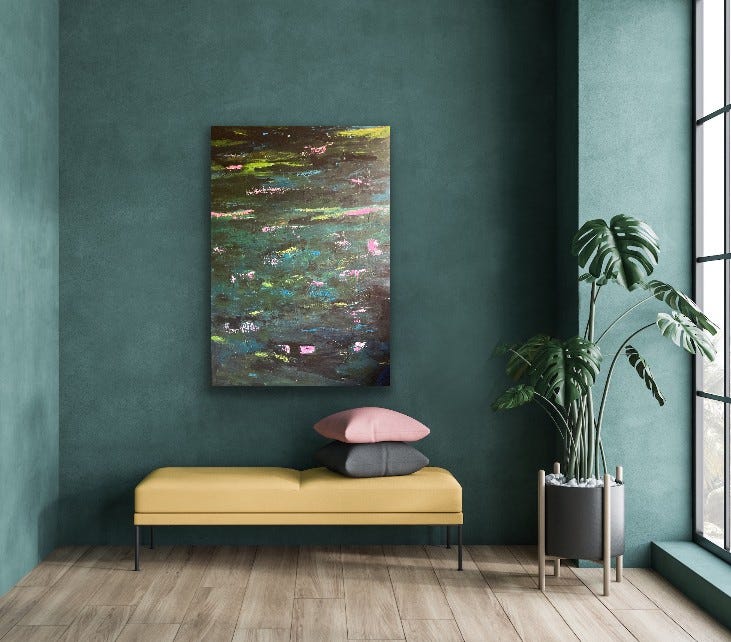
May I introduce you to Summer Picnic. It feels appropriate to do so now, but not because of the season we are in. There are paintings you admire, and then there are paintings that do something altogether different. Something you feel before you understand, something that bypasses language entirely. Summer Picnic is one of those for me. The particular strangeness of this one is that I painted it myself.


Summer Picnic - resting in my deckchair


It has sat unframed for four years now. Not unloved, quite the opposite. But somehow unresolved, because I couldn’t find the words for why it made me smile. Not a wide smile; a more intimate, knowing one. Without words, I wasn’t ready to commit it to a frame, to declare it finished, to send it out into the world. You know me by now - I needed a reason I could articulate. All I knew was that I was particularly happy when I painted it, probably because I was using pink.


Recently, though, something shifted. I arrived at a thought I had always known but needed time to truly believe: art often expresses precisely what we cannot put into words. That is not its limitation. That is its entire point. So the frame went on.


It was placed on a wall during one of the hottest weeks Europe has seen in years. The kind of week where the air shimmers above the tarmac, where time wills you to slow, and where everything feels slightly golden and dream-like. More akin to being on holiday than a normal working week.


Pink and the Science of Calm


There is something pink does that has fascinated scientists and psychologists. They say it calms people down. It turns out there is a reason calamine lotion (that old-fashioned remedy for heat rash, insect bites, sunburn) is pink. The colour is part of the medicine. Soothing is not just chemical. It is also visual. Further reading on the science of pink at the end of this blog.


Summer Is Not a Bright Season


 I’ve noticed in fashion, or on the shop rails, that often when it’s summer we are tempted by the saturated and bright colours of hot pinks, sharp yellows, electric blues. But the truest palette of summer, the one that my memory reaches for, is something else entirely.


Spring is the season of clear, vivid colour. Think of the freshness of new tulips, the vivid green of new leaves. Spring announces itself loudly, triumphantly. There is life, the overcoming of winter in its palette. Summer is different. Summer has already made its point. Think of the light at 4pm on a hot day. The way it diffuses, hazy and golden. The way shadows go soft, not black, but soft grey, even deep shades of lilac. The landscape is bleached; yellow fields are turned dust-pale. These are not bold colours. They are colours that have been left out in the heat, gently faded, gently warmed, gently exhaled.


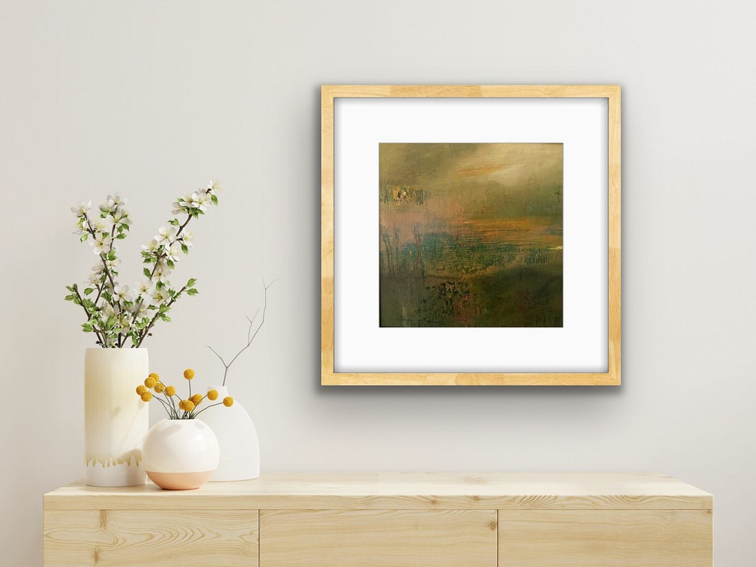
This is something I’ve returned to more than once in my work. A mini series of paintings grew from passing fields in August in East Linton. Probably once vivid, but slowly bleached by the summer sun into something quieter and more considered. Red Roofs is one of those

paintings, named for the faded, once-red tin rooftops of farm buildings just visible beyond the fields. A hint of the human world, small and warm, at the far edge of all that soft emptiness.


Red Roofs 


Summer does that. It doesn’t take colour away so much as distil it down to its essence. The colours of summer in memory are vintage colours. The sharpness has burned off.


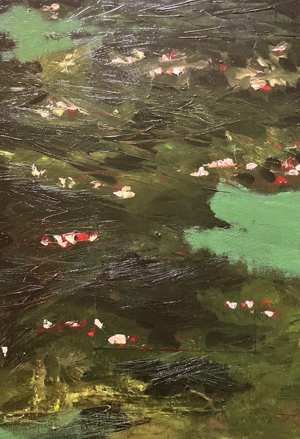
Close up of Summer Picnic


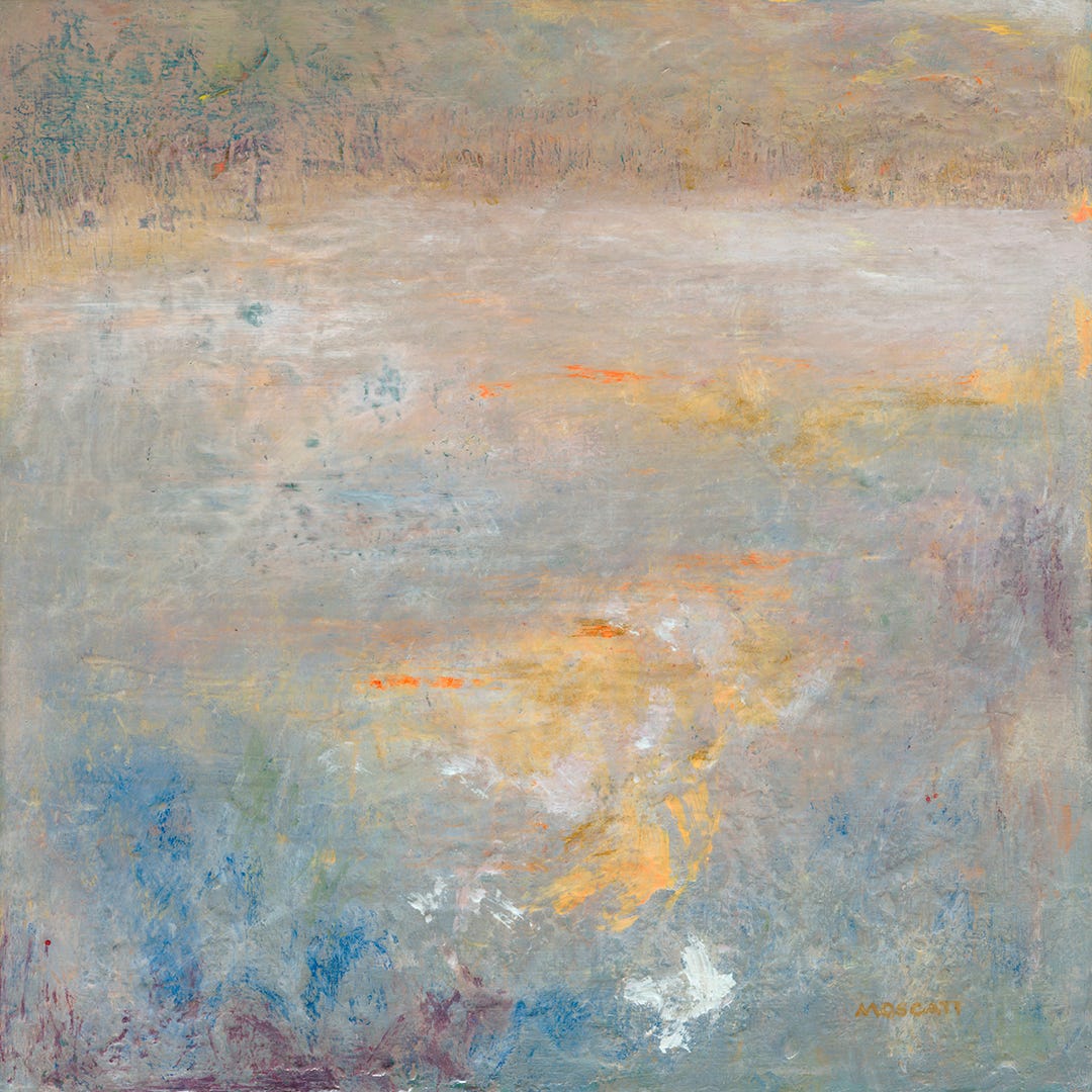
That is what Summer Picnic holds too. The blush, the rose, the soft warm earth below it, the scratched lines of grass stems through paint. It is not a photographic record. It is a felt impression, summer as it is recalled at a distance, more pink than it actually was, more golden, more full of possibility than you quite noticed at the time.


Pink and the Sky


I didn’t come to pink through fashion or branding or any deliberate aesthetic choice. I was introduced to it by the sky. Dusks and dawns have always seemed to me their most beautiful when filled with pinks and oranges, that undeniably gorgeous glow that will lift even a sore soul. A reminder of a heavenly day that has been, or the quiet promise of a new one, full of love and wonder.


This feeling has shown up in my work before. Jean (my first abstract)  came entirely from that sky-watching impulse. That deep rose moving into crimson, the arc of light sweeping over a landscape, gold threading through like the very last of the sun. She sold as an original

but lives on for others as an available print.


Jean - Limited edition 7/100 18 x 18" 


I had a more personal introduction to pink, too. My mother had a summer dress, a pink, 1950s-style sleeveless open-necked dress with a fitted waist and a full skirt that seemed to contain within its fabric an entire world I wanted to belong to. I used to dress up in it as a girl, even though pink was never a colour I was dressed in myself. My colouring, apparently, wasn’t suited to it. But during games of hide and seek, I would hide in my mother’s wardrobe beneath that skirt, imagining myself on a cruise ship, leaning over the rails in it, the sea breeze in my hair.


She had worn it to Rome when she was a young, independent woman travelling Europe alone. That dress had seen the Trevi Fountain and climbed the Spanish Steps. And I was going to do all of that one day too. Now I watch one of my own daughters stop in her tracks whenever the sky does something extraordinary. Completely still. Phone out. She has discovered it for herself. That particular, wordless beauty and it makes me smile every single time. Something passed between us without a single word spoken. Pink as inheritance. Pink as wonder. Pink as the sky at the end of a perfect summer’s day. Which is, I think, what all of this work is really about. Not places. Not specific afternoons.

But the feeling of summer, layered, imprecise, warm at the edges and soft in the centre.The way the best things look when you hold them up against memory.


My latest painting, Rose, arrived most recently and most quietly of all. Oil on canvas, the palest blush with two dark poppy-like forms pushing through. Bold enough to hold the softness accountable, soft enough to let them float away. Rose sold before she had even dried. I think that says something I couldn’t put into words either. That when you stop apologising for what you love, other people feel it.


Rose 


I still don’t have the perfect words for Summer Picnic, but I’ve stopped waiting for them. The frame went on. The paintings kept coming. And it turns out that was always enough.


Further Reading


Curious about the history and science of pink, I spent an afternoon delving into the cultural and psychological context. These were some of the most interesting pieces I found:


Read More

5/22/2026 1:21:53 PM

Two paintings. One Sky. Different moments.


There are paintings you plan and paintings that find you. 


Both of these paintings found me in the same place, standing outside as the day was ending, watching light move through the trees. It's something I've looked at hundreds of times living here in Surrey, yet it never stops me catching my attention, pausing to wonder. 


That particular quality of dusk. The way the sky holds warmth long after the sun has gone. The glow that comes through the canopy and turns everything suspended in pink and briefly, inexplicably more alive, radiant.


I made two paintings from the same view and feelings. 


Sunset through the Trees, is small enough to hold in one hand, big enough to stop you to explore the mini landscape within and the textural sensation. Its' the kind of painting that looks different every time you look at it, which is exactly what I want from a small piece, something that earns its place on the wall, desk or shelf everyday.


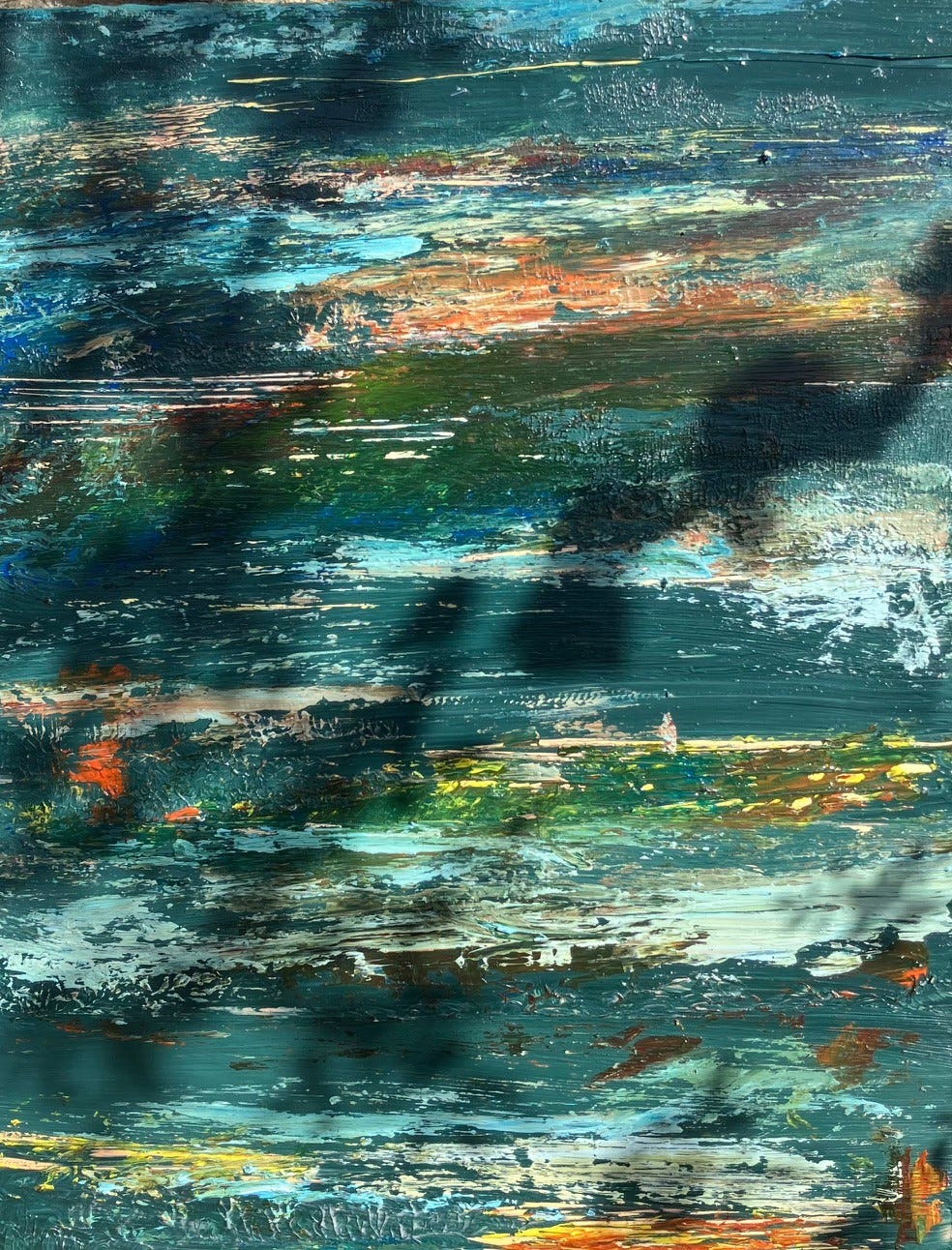
Superpower, is large scale, deep and complex shades of teal and blue, built up in layers over time, with buried traces of yellow ochre, rust and green. This is the same sky, the same trees, but later in the evening. That moment when the light is no longer pink but something darker and more mysterious, and yet there's still a glow. Still something holding on beneath the surface that the darkness can't quite extinguish. 


So two paintings, two moments in the same sky above the same Surrey landscape. One a whisper, one a defiant presence.


You can see both paintings up close at my Open Studio event on the weekend of 20/21 June. 11am to 5pm both days. I hope you can see them both!


Artfully yours

Colette 


Read More

1/5/2026 7:04:01 AM

First day back?

First day back? Me too…

Wishing you a bright New Year and thank you for being here.

Spent a happy morning first with my mother then in the studio. Heating and radio on and back to where I finished off nearly a month ago…that feels decadent..


Working on a view inspired by a heathland walk towards Churt in the distance. The straw like flora was in abundance with all the rain that fell in December, literally making hay while the heather has died down for the year, popping up wherever standing water had arisen. As the author John O’Donohue writes “the quiet miracles that seek no attention” the fescue grasses are having their moment even if quietly. But I see them, quite brazen in their hardy glory and I love to champion them in my paintings. Perhaps, because I feel quite magnificent whenever I am near water too.


My bargain plant from RHS Wisley didn’t have a good Christmas so I’m off to learn about plant resuscitation and trying not to feel guilty, that could possibly be my New Year’s resolution but as many mums will know possibly futile! More on that later…


Spot the new toys…

Masterton stay wet palette (the red lidded tray box) a joy/blessing to an acrylic painter in a sun lit studio, perfect for smaller paintings.

Gold leaf foils….hmm another research project

Benedictus, a book of blessings by John O’ Donohue. I’ve always loved listening to his sweet comforting Irish accent - my Galaxy bar equivalent. However, I feel quite intellectual reading this for a change! 

Happy New Year, may your path be full of wonders.


Read More

4/28/2025 12:08:06 AM

Monet and I….


My largest pond artwork 150cm x 100cm

This is a copy of one of my a Substack articles. Substack is my free subscription monthly service that I use to explore and explain the inspiration behind my artwork as well as details of exhibitions. If you would like to sign up to this free service then let me know or follow this link 


Forwarded this email? Subscribe here for more

View my latest artwork at www.colettemoscatifineart.com


Monet and I....

My ponderings

Dearest Gentle Art Reader,

Would you believe I share a few things with dear Claude Monet:

   
Be Still My Soul by Moscati


  1. Prints of our art are both featured under artists beginning with "M" on a couple of art websites!! Link to prints but also we have shared the same wall regarding the movement and influence of impressionism.

  2. We both have ponds in our gardens albeit different sizes.

  3. We both had/have a fascination of painting ponds in their different seasons and times of day.

   
Mini pond - series of two cradled panels by Moscati


His work has inspired me ever since I had the opportunity to see his “Grands Décorations” up close. I was transfixed and completely absorbed by both the abstract nature of the brushstrokes and the powerful scale of the pieces. It was overwhelming, but once I found a place to sit and absorb it all, countless questions sprang to my mind: How did he manage the practicalities of painting this? How must he have felt when presenting it to the world? How long did it take to create? How did he get up the scaffold at his age? How was it transported here to London? How long did it take to dry completely? The questions just went on and on.

   
Another painting from the Pond series (with dappled shadows not included!)


At the time, I came away with a heart full of inspiration but I will admit also a twinge of envy. Imagine having all that time to paint and create something that you loved and having the confidence to ignore powerful critics, as he did for so long in his early career. I remember also feeling slightly deflated that day. However, I firmly believe that what makes us feel like this often indicates an unmet desire and provides an opportunity to explore our own insecurities or feelings of inadequacy.

I left that day with an unsettling sense of lacking. It had triggered an unmet desire to be a professional creative. I can almost hear the smallest of violins playing now as I write this, as there is a happy ending, as you may already know. After that experience, I signed up for evening adult education classes in London, then in Guildford and Farnham, basically wherever I worked I decided to have art education and exploration in my life. I worked on illustrations, life studies, clay modeling, watercolors, pastels, and silk painting. I dragged friends with me and accepted invitations from others too (you know who you are!). I created my own Foundation course in art and cherished the escape from a work day of numbers to spend time with other artistic people, being a student again and immersing myself in a different, happy zone.

   
My largest Pond artwork at 150cm x 100cm for sale at Open Studios

When I look at artwork, I still think about the time the artist spent in their happy zone (or, as I now know, the various stages of creation—ranging from “This is going to be my best piece” to “This is never going to work” to “I don’t care if anyone hates it; I love it!”). I ponder why they made certain marks or chose particular colours. Did they paint standing up, at arm's length, or throw a spot of paint in a fit of angst or pleasure? There is just so much you can read into a mark.

The pond-inspired artwork you see here now is my happy ending to the overwhelm I felt in my 30s. My lily pond at home is but a teeny fraction of the one at Giverny, yet I am blessed with one and have access to many others within dog walking distance. My pond artwork is an amalgamation of my favorite techniques, and I only struggle to decide which pond inspiration and colours will be my focus that day. My works range from 6 x 6 inches to 60 x 40 inches—the latter being restricted to the maximum I can fit in my car boot! So when you see my pond work, see the marks and also the full circle that I have journeyed: I’m so grateful that this is one loop I have been able to close. Not everyone does, and that feeling can eat away at people; I know it did for me for a time. I would never have guessed people would be collecting my artwork. Being free to create, and making connections with people on a level I didn’t dare to think about never escapes me.


Extract of Ripple Reverie available as a Limited Edition Print of 5

I hope you will be able to experience these works for yourself. I can’t promise a Monet-type reaction, but each piece is filled with potential, passion and a willingness to share the joy I feel when being near these pools of wonder.


Original available at Open Studios and prints to order


Surrey Artists Open Studios runs from June 7th to June 22nd. My studio will be open each Thursday to Sunday from 11 AM to 4 PM, late on Thursdays. Meet artists in their studios, homes, and galleries to learn about their stories and what inspires them and hopefully resonates with you.

Wishing you a lovely month ahead, and I hope to see you soon.

Artfully yours,

Colette x

If you think friends or family would enjoy these short articles please forward this free subscription service to them - thank you!


Read More

10/12/2023 7:20:48 AM

What’s love got to do with it?


Connected by love

I really wanted to focus on some LOVE in my art life.


The inspiration


In looking through my memory love bank I singled out a game called Mah-jong. It's not because I am any good at it, as I frequently have to ask my mother for a quick reminder of the rules and certainly how to add up the scores. However, given I wanted to create a cohesive series I thought this could be good inspiration fodder.


The designs/characters used in the game, like traditional card packs, have not changed significantly. Given my style of intuitive led art when I really thought about the game I wanted to be inspired foremost by my personal experience not the symbols or icons. And in thinking of my what it meant to me I distilled this to three words - playful, connected and presence.

Playful needs little explanation but perhaps presence does. I find it difficult to focus completely but people, art and games that I enjoy do get my undivided attention. And when that happens the clock stops and the joy starts. To be truly present is a gift in my day. However, if I had to pick one word that I felt motivated me to move my paint for, it had to be 'connected'.


Unlike other games, the real reason I love my Mah-jong set is that it once belonged to my mother and to her parents before that. I suppose it is an antique now! However old it is, every single piece of the 144 tiles are still there unlike most board games in my house! It is a travel size version and even seeing the case on my shelves, without even taking out the tiles, my heart really smiles. Like a photo of my family before me it raises such a feeling of nostalgic love and when I play the game with my own children now there is a feeling of such connection not only to my family but also part of my Eurasian heritage.

Everyone loves to belong/feel a common association, and something about that game feels like home in a way no national game makes me feel. My children are equally enthralled by the set too. It's so funny to be chastised by them when I provoke them by putting the tiles back in no particular order!


The Chinese character designs are predominantly common in all sets and when you shuffle them on the table the clacking noise is so satisfying! Somewhere I read that the original Mah-jong game was named so as it translates to Sparrow as the noise of clacking I mention is symbolic of the chattering of sparrows. 


The process


I often paint on a square surface but the tiles are rectangular so I chose A4 boards to paint on to get into the inspiration zone asap.


Next I chose one of the four suits for my first layer for the first ten paintings. I love bamboo and I am a “stripes” person but that felt too obvious to start with so to play with another difference I chose coins/dots to channel. As soon as I began there was something novel for me and yet soothing about painting the circles and of course “join the dots” played into my connection theme. 


I then chose cerulean blues to fill around the circles representing my love of water and also the fact that I learnt how to play Mah-jong in Scotland not Singapore! Painting all ten together was     not only productive but added an element of cohesiveness to them being part of a series so I decided to keep painting them together for as long as possible as part of the process. I could only fit 10 on my table so started the other five separately but together so that they would also benefit from a cohesive approach too. 


The simplicity of this first stage was satisfying and quite meditative but after a while became bland! I was keen to move on to the stage of funking it up as opposed to the colouring in exercise it had become to me. 


I took a glaze of Payne’s Grey and then covered everything up. I was ready to go intuitive/off piste. Having put the base layer of mahjong down I wanted to get layers on top so that these characters would become part of the history. 


I also added a layer of collage  using gloss medium. I had painted and then ripped some old book pages to make bamboo like shapes to paste onto the boards. 


Now the fun….acrylic ink drops are really cool. Like watercolour or pouring mediums you can create some crazy patterns with the help of a hair dryer to push the ink around. I used muted turquoise, burnt sienna, and muted blue. You can see the abstract shapes in the photo that were taken at this stage. 


The other suit of characters in mah-jong that I love is the Flowers Suit. I decided these characters would influence the final layers of some of the paintings. I chose colours such as red, pink, white and oranges for dahlias, chrysanthemums, orchids and hibiscus. I used the forms from the ink play to guide me intuitively to shaping forms like stems, flower heads and nature designs such as seeds and leaves using paint and sgraffito techniques to reveal sub-layers of colours and textures.  


I love layering in my artwork and this time it felt really key to symbolising the nostaglia and also the realistic art symbols of the suits of coinsdotsbamboo all encased like hidden treasure to find  under the other layers. 


I hope you enjoyed reading about the inspiration behind these 4 pieces shown here today. I will be creating reproduction prints of these and the other 7 artworks. If you are interested in coming to my next exhibition or art fair I would be delighted to send you an invitation or you can follow my art on my website at www.colettemoscatifineart.com and send me an email there. 


Love life love art!


Colette x


Read More

4/22/2023 10:58:11 AM

Oh to be a cow......


Close up of Burano, hanging at The Mill, Elstead

At the moment I am juggling making art, framing art, pricing art and the other roles I love in my life. It's temporary busyness just now till my next event at RHS Wisley (27 April - 1 May) is over but it's been good to remember to take a step back into nature, stop and look for a new shape, colour combination or texture.


Or just shut my eyes for a few minutes while brewing a cup of tea. When I opened them I saw some tiny birds chasing each other, so sweet and mesmerising.  It reminded me of this poem below. It's so important to stand and stare (cow like)! 


What does this have to do with art? Well one of my favourite past times is looking at artwork. Whether it's in front of you, in the station's waiting room or your neighbour's hallway stopping to have a stare at artwork is fascinating to me. I love to see the whole visual imagery but also sense where the artist's mood was or follow the brushstrokes and see if I can work out where one stroke begins and then ends. There's even a story in the energy of the mark making. It is the kind of story I love to read. I am looking forward to having more cow time and staring at the Vermeer exhibition soon! Now that is a perfect treat after all this rushing around! Until then I am going to look out the window next to the kettle and enjoy staring each time I take a break!


I hope you enjoy this poem below! 


Colette x


Leisure  by W.H. Davies


What is this life if, full of care,

We have no time to stand and stare.


No time to stand beneath the boughs

And stare as long as sheep or cows.


No time to see, when woods we pass,

Where squirrels hide their nuts in grass.


No time to see, in broad daylight,

Streams full of stars, like skies at night.


No time to turn at Beauty’s glance,

And watch her feet, how they can dance.

No time to wait till her mouth can

Enrich that smile her eyes began.


A poor life this if, full of care,

We have no time to stand and stare.


Read More

4/3/2022 1:47:10 PM

Yes! At last my first Limited Edition Print of 'Jean'


First Limited Edition (100)

At last I found a suitable reproduction solution to create my first Limited Edition print. I really wanted to find a solution that would capture faithfully my mark making and portray the 3d elements of my work. It has been a fascinating journey. I have opted for a process which scans the original artwork to produce exceptional levels of details. Three dimensional illumination is used to ensure even reproduction which means that light fall-off to the corners is avoided and the three dimensional properties of the mark making is captured in a way that makes you want to reach out and touch it! Meeting the craftmen involved in this process I could see that their review process was an art in itself, and the attention to accurate colour matching supplemented by their colour matching was far more experienced than my eye could ever have achieved! I really do believe I have found the best ability and they are in Surrey!


Of course, I chose Jean as my first print. Some of you may know that it is titled so after my parental Scottish grandmother Jean. She was an artist herself and I loved spending time with her. In art galleries, at her exhibitions, touring and photographing landscapes in Scotland, Spain and Italy for inspiration, painting oils along with her and 'Nancy Kominsky' and modelling for her portraits. 


She was a nurse in London during the second world war. I vividly remember the sparkle in her eyes as well as her matching handbag and shoes and hair styled just like the Queen. She moved back to Scotland to set up a small holding with pigs, cats, sheep, goats and geese. It was an Enid Blyton children's story book setting on a peninsula in the Highlands.  


She wore a powdered face with rose pink cheeks and lipstick. She always wanted to grow flowers in her garden by the sea however the winds would often blow in seeds and golden grasses and wandering livestock would thwart her flower beds. She drove a bright yellow car(s) and had an entrepreneurial spirit.


Given she was instrumental in filling my childhood holidays with art I hope she will be delighted with this tribute to her. 


Read More